
Figma
A powerful design tool used to create website layouts, prototypes, and user interfaces. It allows real-time collaboration, making teamwork easy and efficient.

Bootstrap
A popular CSS framework that helps build responsive and mobile-friendly websites quickly. It includes ready-to-use grids, buttons, and components for faster development.

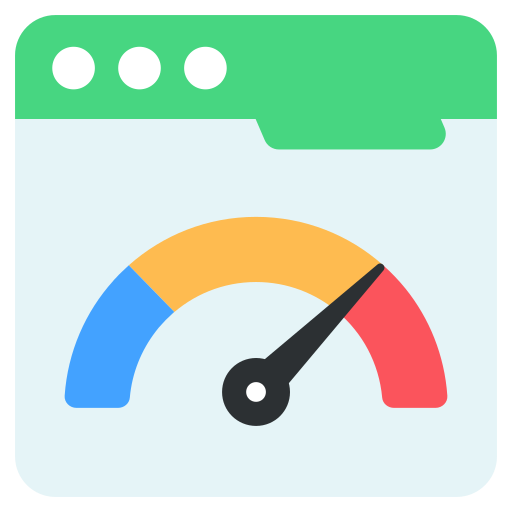
Google Lighthouse
A free tool that checks website performance, mobile-friendliness, and SEO. It provides detailed reports to help improve speed and user experience.

BrowserStack
A cloud-based testing tool that lets you check how your website looks and works on different devices and browsers. This confirms a even experience for all users.

Chrome DevTools
A built-in tool in the Chrome browser that helps developers test, debug, and optimize websites. It allows checking responsiveness on different screen sizes.
Page Speed Insights
A tool that analyses your website’s loading speed and suggests ways to make it faster. A fast website improves user experience and SEO rankings.

HTML

CSS

Java Script

React

Type Script
Tailwind CSS

WordPress
Next.js

Node.js

Django

Python

SQL

Premium Quality
Every line of code is crafted with precision and attention to detail

Lightning Fast
Optimized for performance with sub-second load times

Scalable Solutions
Built to grow with your business from startup to enterprise

24/7 Support
Dedicated team ready to help whenever you need assistance
Modern Stack
Using cutting-edge technologies and industry best practices

Proven Results
Track record of successful projects across various industries


